With the Pareto Ads Advanced Dashboard, you can manage the performance and main KPIs of your media channels linked to the platform. Choose the best level for your analysis, either account level, with data relating to Google or Facebook, or Company level with aggregated data.
But first, if you still don't quite understand how our hierarchy system works, just go to the article explaining Pareto.io's Hierarchy System. Or, if you're not yet familiar with the first steps in the Dashboard, you can start with this article here, and then read this one.
Customizing the graphic
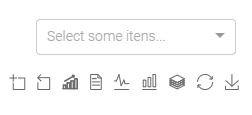
To begin with, let's understand how our chart customization options work via the campaign and icon selector.

Select Some Items allows us to monitor the performance of one or more campaigns and specific audiences in isolation. To do this, simply select the ones you want and continue with the analysis.
We can also modify our visualization of the graph with the icons below this selector. The 9 icons are shown from left to right:
#1 Zoom (+) in on the graph
Imagine you've selected a period of one year and some behavior on the graph has caught your eye, but you're not sure which period it happened. Simply click on the icon and "cut" the graph to this period.

#2 Undo Zoom
In the same situation, after identifying the dates and being able to analyze the behavior, you click on the second icon and it continues to undo the assigned Zoom.

#3 Group data over time
Get an overview of the data accumulated each day, and the evolution of the account within the selected timeframe.

#4 Get the data in table format
Do you want to use the data in a separate spreadsheet? With this icon we can copy the data and export it for later use.

#5 Data in area format (figure)
Switch to an area/figure view of the graph's curves.

#6 Visualize the curves in column format
Prefer to analyze like a bar chart? This icon will allow you to analyze the metrics in columns, and you can even stack them by combining them with icon #7.

#7 Stacked Data
Get an overlaid view of the data, so you can analyze the summary distribution of the data for the selected metrics.

(Above is the view by Campaign Type in Segments)
#8 Standard Display
If you have made some changes and want to return to the default view of the graph, simply select this icon.

#9 Download the graphic
Don't worry about prints, this icon downloads the graphic in PGN and you can use it to compose your presentations.

Adding Advanced Metrics
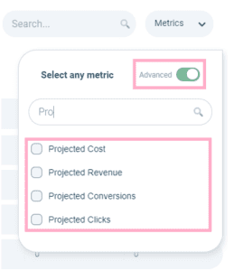
Tracking what the account can bring in terms of estimated results, from budget to conversions and revenue, is also a strategic part of the account. That's why, in addition to the basic metrics that we can add to the Dashboard table, we can track cost, click, conversion and revenue projections. Simply click on the "Advanced" switch and select the projections you want to monitor.

KPI's available at Big Numbers
Our Big Numbers provide consolidated metrics for linked accounts, either separately or in aggregate, as well as a comparison with the previous period and/or the previous year. The source of the data may vary; the icons identify the source:
After all, how do you export this data from the Dashboard?
We know that all these customizations are relevant for building reports and presentations, so today it is possible to export the data via prints, download the graph and copy the data for use in spreadsheets. As we don't have a button to turn it into a PDF, you can press Ctrl+P and instead of printing, select to save it as a PDF (with, for example, orientation: landscape; scale: between 70% and 80%).


