Neste artigo, será abordada a aba de Insights do Pareto Ads e como interpretar os dados para obter informações interessantes para a conta.
O que é a aba de Insights?
A área de Insights está dentro da visão de Marketing do Pareto Ads. Esta aba é responsável pela visão de métricas de forma estratégica, para auxiliar o gestor da conta com uma visão diferenciada dos dados e a partir da interpretação, gerar ações importantes para a conta.
Atualmente, pode-se dividir os gráficos em 3 análises: Comparação do dia da Semana, Comparações do Dia a dia e Eficiência de Custo. Veremos cada um deles a seguir.
Comparação do dia da Semana
A comparação do dia da semana é feita a partir de um gráfico com duas métricas sendo analisadas ao mesmo tempo. Dentre as métricas, é possível escolher: custo, impressão, cliques, conversão, receita, CPA, ROAS, CPC, Impression Share.
Para melhor ilustrar alguns possíveis Insights, vamos analisar uma conta de demonstração de um e-commerce.

O gráfico acima apresenta a primeira visão do Insight com duas métricas: Custo e Impressões. A princípio, percebe-se que a distribuição de impressões e custo não é linear, ela possui uma sazonalidade semanal, o que varia de acordo com a segmentação da conta.
Analisando Métricas no Gráfico
A primeira dica para esta análise é entender como está a distribuição do seu investimento e o volume de retorno. Para isso, vamos analisar duas métricas: Custo e Conversões
No gráfico abaixo, vê-se o custo ao longo dos dias da semana, representado pelas colunas em roxo. Já as conversões estão representadas pela linha verde.
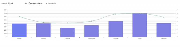 Analisando o gráfico, percebe-se que temos dias de maior investimento que não compensam o resultado de conversões. Em uma gestão manual de conta, essa visão de dados nem sempre é prestigiada, o que dificulta a análise de conta.
Além disso, o Pareto Ads, através das sugestões, tende a fazer um maior equilíbrio entre os valores de investimento e os dias de menor retorno para a conta. E, também, através do algoritmo que realiza ajustes de lance para dias da semana e hora do dia.
Como o exemplo se trata de um e-commerce, também é importante analisar dois pontos críticos: ROAS e Receita.

A primeira impressão é bem clara através do gráfico: o melhor dia deste e-commerce é às quartas-feiras. Este é o dia que traz a melhor receita com o melhor resultado de ROAS.
Entretanto, olhando para o primeiro gráfico (que mostra o Custo e Impressões), pode-se afirmar que é um dia pouco explorado por parte da conta. Ou seja, caso aumentássemos o investimento neste dia, existe uma probabilidade de expandirmos o potencial de receita.
Este caso também pode ser observado na sexta-feira, onde temos um ROAS próximo à média dos demais dias, porém com o segundo maior pico de receita.
Mas os Insigths podem, inclusive, ultrapassar a visão do gráfico. Dessa maneira, eles geram algumas ideias importantes para o negócio, por exemplo:
- Qual seria o melhor dia para lançar um produto ou uma promoção?
- E qual seria o melhor dia para interromper a promoção?
- Qual dia escolher para fazer uma manutenção no site?
Comparação do Dia a Dia
A comparação do dia a dia é a segunda etapa da aba de Insights. Esta análise é capaz de trazer as mesmas métricas do gráfico anterior, comparando três momentos:
– Hoje x Últimos 90 dias
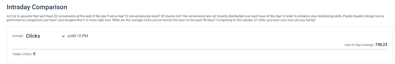
Já nesta visão, consegue-se comparar o resultado até a hora atual, em relação aos últimos 90 dias. Mas o que é possível tirar de Insights?
- No gráfico acima, temos zero cliques e uma média de 738,23. Neste caso, pode-se afirmar que existe algo de errado na conta. O gráfico não foi criado para entender a origem deste erro, mas sim para identificar rapidamente quando há algo de errado na conta. Para esta questão, temos muitas possibilidades: conta sem saldo, anúncios reprovados, campanhas concluídas ou pausadas, entre outras opções.
- No próprio gráfico, temos 3 cores: vermelha, cinza e verde. O primeiro caso indica variações negativas, que podem estar sendo causadas por situações atípicas. O segundo já está relacionado a uma variação abaixo da média, porém dentro do esperado. O último já está relacionado a uma variação próxima ou acima da média.
– Dia do Mês x Últimos 3 meses
Para este gráfico, tem-se a visão mais global da métrica, uma vez que temos uma ideia de como a métrica se comportou nos últimos 3 meses. A partir dela, você poderá analisar a evolução dos últimos três meses e tirar Insights mais estratégicos.

No gráfico acima, temos uma média de cliques bem próxima da média dos últimos 3 meses, indicado pela situação verde do gráfico. Neste caso, não temos muitos insights, entretanto, ao analisar a métrica de conversões:

Então, é possível dizer que o mês atual está muito acima da média em termos de conversões, o que representaria um momento de alta sazonalidade, ou até mesmo uma evolução da conta.
– Dia do Mês x Últimos 2 anos
Este último gráfico é o mais estratégico da análise. Removendo a visão de sazonalidade, é possível entender toda a evolução da conta, comparando os resultados com os últimos 2 anos. Na demo, pode-se interpretar duas métricas: Custo e Receita.


Logo, é possível concluir que esta é uma conta que está perdendo evolução no tempo. Comparando com os últimos 2 anos, tem-se uma redução de 43,4% em termos de custo e 70,1% de receita. A variação brusca de receita é interpretada pela cor vermelha, que indica uma queda muito acima do esperado para um conta. Logo, pode-se ligar o alerta de criticidade para entender o por quê o investimento recuou e como isso está afetando a receita.
Eficiência de Custo
A eficiência de custo está associado diretamente a métrica da Razão de Pareto, na aba de Análise de Risco.
O que a Razão de Pareto? Ela é uma métrica criada pela Pareto para medir a razão entre o custo em termos de busca versus o custo com palavras-chave. Essa razão traz alguns insights para a conta.
A análise da Razão de Pareto permite avaliar o quanto de custo que é ou não gerenciável. Para contas em modelo de expansão, é normal que esse percentual seja maior, em torno de 60%-70%. Já para contas mais controladas, o ideal é que o percentual seja mais baixo.
Portanto, um baixo resultado nesta métrica, indica que você possui poucas palavras-chaves na sua conta, o que seria uma gestão muito conservadora, podendo estar gastando demais com termos de busca que não necessariamente são qualificados.
Caso os termos de pesquisa tenham uma alta taxa de conversão, podem-se adicionar novas palavras-chave em modelo SKAG. Dessa maneira, poderemos controlar melhor a conta. Porém, caso a taxa de conversão esteja baixa, deve-se fazer um trabalho de negativação
No gráfico abaixo, tem-se a proporção de termos dentro do funil, sendo:
- Topo do Funil: Volume de Buscas;
- Meio do Funil: Impressões e Cliques;
- Fundo do Funil: Conversões.

Então, analisando o caso acima, tem-se a situação de altíssima eficiência de custo, ou seja, é possível balancear conversões vindas de termos de busca e de palavras-chave.
Em uma conta de Google Ads, é comum termos a maior concentração de investimento em termos de busca. Apesar de não controlarmos os termos, eles são respo˜nsáveis pelo volume de conversões e evolução da conta como um todo.
Apesar da concentração de custo estar em 87,57% em termos, eles representam 47,05% das conversões da conta, ou seja, termos que possuem uma alta representatividade de conversões.
Resumindo a aba de Insights
Então, nesta aba é possível tirar diferentes insights para a otimização da conta e definição de estratégias de negócio. Resumindo o que foi visto nessa aba:
- Através dos gráficos, entenda o comportamento da sua conta no decorrer da semana;
- Assim, seja mais estratégico para implementar promoções, incluir novos produtos, fazer manutenções no site ou, até mesmo, distribuir folgas no atendimento comercial;
- Outra possibilidade é a identificação de variações atípicas de métricas de maneira simples;
- Da mesma maneira, analise a evolução da sua conta, comparando com os últimos 3 meses e nos últimos dois anos;
- Por fim, saiba como está a eficiência de custo da sua conta e se os termos de busca estão trazendo conversões ou você está investindo em termos pouco qualificados.
Depois dessa apresentação, acesse a aba Pareto Ads e tenha novas ideias para a sua conta!
Agora, se quiser conhecer melhor outra aba do Pareto Ads, a aba de Risk Analysis, acesse este outro artigo da Pareto.
Conheça as diferenças entre as estruturas de Google SKAG e STAG neste outro conteúdo do nosso Blog!