How Graphic Design can be your main ally in improving the performance of your ads.
Need to create a banner from scratch and don't know where to start? This article will help those who are looking to improve the visual communication of their creatives, citing 10 Elements that should be applied, their relevance, their impact and tips for use.
The 10 Elements

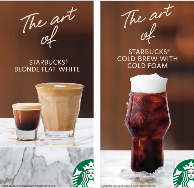
Visual Identity - Starbucks Coffee
1. Don't forget your Visual Identity
When we talk about Visual Identity, we are talking about a set of graphic elements that are created with the same language so that your brand is presented in an integrated way to the market.
"Visual identity is the set of graphic elements that will formalize the visual personality of a name, idea, product or service" (STRUNCK, 2001, p. 57).
These elements can be Colors - having a color palette is essential and has great weight in the integration of your Identity. Also, pay attention to the psychology of colors and select those that effectively convey the brand's personality;
"[Standard colors] are intrinsically related to the companies they represent, they are part of their visual personality and can be recognized from great distances, even before we can read their symbols or logos" (STRUNCK, 2001, p. 79).
- Typography - fonts and letters used in all your printed and digital material;
- Iconography - simple illustrations designed to facilitate brand communication, as well as other types of images that fit in with the rest of the elements;
The main aim of this method is to make it easier for potential customers and users, or anyone who is impacted by the brand, to recognize it. The more uniform and harmonious the elements of a brand are, the more likely it is that it will be consolidated in the market.
2. Main Call

The call to action is one of the most important and prominent devices, as it will be responsible for conveying to the user the main function and objective of your creative. This objective needs to be thought out and idealized before creation, so that the creator has in mind who they are targeting with these words and how best to write them.
Defining a tone of voice for your brand is also very important, both for finding your place in the market, but also for transparently showing your brand to your customers and potential customers.
Don't forget that there needs to be communication between your creative and your page - whether it's a landing page, website or social network. Since the call-to-action is a sneak peak, in other words, a preview of what the user will find if they click on the ad.
Topic 9 explains in more depth how the amount of text can interfere positively or negatively with your creative.
3. Call to Action button

The Call to Action, together with the Call, is an invitation for the user to understand more about your service, your brand, your product.
This invitation always needs to be highlighted - often in the form of a button. And also a phrase that encourages the user to want to know more, to want to explore beyond what is being advertised.
The Call to Action button can't be an extraneous element in your creative. Highlighting the Call to Action doesn't mean differentiating it from the rest of the elements. It should integrate harmoniously with the creative and fit in with all your brand's visual communication too!
4. Highlight the product or element being promoted

It's very important to understand the focus of your creative. Are you aiming to sell a service? Or perhaps a product? Make that clear.
Give it the necessary prominence. But remember that this doesn't mean giving it an exaggerated visual prominence that borders on visual pollution. The following topics will explain how to avoid this type of mistake.
5. Good quality images (and with vents)
Implementing good quality images from a good image bank makes all the difference. But remember that obvious images won't always communicate best.
It's very easy to get carried away with images that show exactly what you want to sell. Other approaches are also interesting, such as slightly more conceptual and abstract scenarios, but always bearing in mind that it is essential to know what kind of atmosphere you want to convey to the user and how you want your brand to be seen.
Another point that must not be forgotten is the space that this image will occupy in your creative. You need to know how to balance photographs, illustrations and icons well with your text spot - the space taken up by your text box - so that the Call to Action doesn't lose its impact.
6. Well positioned logo (if necessary)
Often you will need to implement your Logo or just your Symbol in the creatives. Be careful with this action. Is your logo important? Yes, but in most cases, the emphasis should be on the rest of the elements.
However, if your focus is on presenting your brand and you purposely want to give it the spotlight, then feel free to explore and try out new things!
7. Alignment of elements and Grid

Defining a Grid for your creatives or at least knowing how to align all the elements contained within it is perhaps one of the most important actions for good performance!
A grid is nothing more than a grid made up of vertical and horizontal guides that will help you organize each element in your banner.
And why is it so important? In addition to giving harmony and more exact proportions to your banner, keep in mind that if it is well organized, clean and functional, your chances of conveying seriousness and commitment to the user will be greater.
8. Supporting elements and/or visual effects
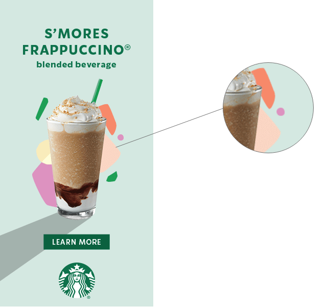
Example of how a few simple shapes can make your creative more elegant!
These elements may not be obvious to everyone, but they will certainly make a difference to your creative.
Using a filter or gradient with colors from your palette to enrich your images or your Background is a popular method. Or doodles, doodles or simple shapes that can make your product stand out.
Just be careful not to overuse these elements and effects, as their main function is to complement your creative in a subtle and elegant way.
9. Less is more
A sentence with more words doesn't always mean a clearer communication or message. Keeping your text short and punctuating what really needs to be said in words is essential for a good understanding of your banner.
Also, remember that Facebook can limit the placement of your ad if it has too much text. So it's always a good idea to pay attention to this!
Also take care with the readability of your text. What's behind it? Is it getting in the way of reading? Is the text too small? Details like these can make all the difference to the impact of your banner and consequently to your conversions.
10. Saving...
Well, a well-made banner doesn't matter if it's not saved in good quality at the end of the process.
In the midst of so many images and ads that your potential client will come across, having a creative with vibrant colors or clear text makes all the difference! So never forget that when you save your file, it should be in PNG, colors in RGB, 72 ppi. These settings are sufficient and ideal for digital art.
You may need to reduce the quality of your material a little in some cases - a GIF, for example, is only accepted at a maximum of 150 kilobytes on Google. But that doesn't mean that when it comes to creating, you'll have to let go of the quality of your artwork.
Conclusion
Remember that each creative is a blank canvas ready to be filled and a new opportunity for your company to stand out positively in the market.
Follow these steps, awaken the creative side in you and good luck!
images: lovelypackage.com | moat.com